Visual Effect

Leave a comment

In iMovie, you are able to choose from a variety of video effects which include negative, cartoon, and x-ray. Because the theme of my animation is dark and creepy, and is in black and white, I decided to use the black vignette effect, which adds a dark circle around the two sides.

Image

Audio Effect

Leave a comment

After finishing the editing in Final Cut Pro, I exported the animation to Desktop, then imported into iMovie. In iMovie, the software allows you to use various audio effects. The effects range from having a robotic voice, or an extremely pitched one. Because the title of my animation is a hymn, I decided to use the ‘Cathedral’ effect, which added a slight echo. The sound effects also sound far better, and fit in more with the title.

Screen Shot 2013-05-21 at 13.07.23

Broken Bar

Leave a comment

To create the broken bar, from when the tall character climbs up and breaks it, instead of using Photoshop or Illustrator, to make the quality the best possible resolution, I used the original JPG, duplicated it and then cropped out the music notes that I wanted to break. I then imported both images into After Effects, and used the various anchor points to change the positioning and rotation. I placed a plain white image over the full JPG, where I wanted the bar to break off from, the placed the cropped image on top, so that it looked as if I had used layers.

Screen Shot 2013-05-10 at 15.23.03 CheatSheetHighScreen Shot 2013-05-21 at 12.08.43 Screen Shot 2013-05-21 at 12.08.51

Sound Effects

Leave a comment

Throughout the animation, various sound effects will be used. Instead of creating the sound effects myself, through modern technology it is now easy to find various websites that have free, un-copyrighted sounds that anyone can use. The website where I found the sound effects is www.freesound.org. The first sound effect I found that I wish to use was for the opening scene, where the characters are walking across the screen. The closest sound I could find was of somebody walking through long grass, which seemed to work well. Image

The second sound effect that was used is when I used the Ken Burns effect to zoom up to the title of the score sheet. I found a sound on the website that was a quick ‘woosh’, but I managed to slow it down, so that it fits in time with the visuals. At the end of the woosh, I also added a Crash symbol, to emphasise the sounds. The next shot is close up of the characters faces, with their mouths opening wide in a sense of shock, knowing that they have to climb so high. The sound I used here was a elongated gasp, which I managed to make start when they opened their mouths, and finish when they closed them.

The final sound effect that was used when one of the music bars breaks. The effect is a wooden plank being snapped, and it fits in well with the visual.

Screen Shot 2013-05-21 at 12.08.16 Screen Shot 2013-05-21 at 12.08.43 Screen Shot 2013-05-21 at 12.08.51

Eye movements

Leave a comment

For the shot where the four characters are shocked whilst looking up to the title of the score sheet, I needed to make each of their eyes move upwards. To do this, I select whichever eye I want to move, or both. So I highlight the correct source name.

Screen shot 2013-05-21 at 12.14.45

I then select the anchor point for the scale and position of the eye, so that any movements and changes that will happen in a few seconds, it will always start at that previous size and location. Because I want the eyes to move upwards, I start both of them in the centre, then moving along the time bar and move the eyes manually upwards, which then automatically adds another anchor point, meaning I do not have to do anything else.

Screen shot 2013-05-21 at 12.14.40 Screen shot 2013-05-21 at 12.15.01 Screen shot 2013-05-21 at 12.15.08

Music

Leave a comment

Fortunately for me, I have a relative who his in the music industry, and one of the artist’s he has worked with had recorded their own version of the hymn ‘Jerusalem’. The music of the hymn was written by Sir Hupert Parry in 1916, with the lyrics taken from the Blake poem that I have chosen. The artist who covered the song is called Natasha Marsh, and luckily I have been able to use it free of copyright. The fact that I can use this song may add a bit of power towards to end of the film, where they are reaching the top, instead of using a cheesy Garageband loop. The song also adds another direct reference to Blake and the poem itself. Instead of using the version which had vocals, I decided to use the instrumental, meaning that it would be easier to cut down and edit.

Title

Leave a comment

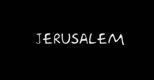
The title of the animation is ‘Jerusalem’, which is what the hymn is called which used Blake’s poem as lyrics.

I wanted the title to pay a direct tribute to William Blake, and be something that people will automatically know what it might be about. Other titles that went into consideration were ‘And Did Those Creeps in Ancient Time’ (referencing the creepiness of the characters) and ‘And Did Those Feet in Modern Time’. However, I thought that Jerusalem is easy, neat, and relates to the score sheet, as well as the soundtrack used.

I created the title in Final Cut Pro, and downloaded a font that had a retro feel to it. I didn’t want anything fancy, and to match the colours of the film, I kept it just white writing on a black background.

Screen Shot 2013-05-21 at 12.14.11

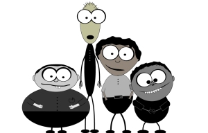
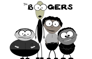
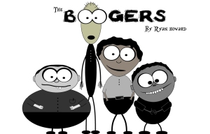
After ‘Jerusalem’ appears on the screen, the word featuring does, followed by a still image of the four characters. After the image is on screen for 1.5 seconds, the text ‘The Boogers’ appears, with the double ‘O’ being used as eyes for the tallest character. My name then appears, followed by dissolving to black.

Print Print Print Screen Shot 2013-05-21 at 12.14.03 2

Flies

Leave a comment

Another idea I had was to create some bugs/flies to fly into the screen and annoy the characters. Like the main characters in the film, they each have their own look/personality. To make their personalities different from each other, I changed various parts of their faces, as well as their shade of grey, which was the main colour of them. Each of them is the same size, and has the same shape eyes. Although each of the pupils change in size, as well as one of them having eyelids, which I felt made him look more rebellious and ‘cool.’ Their mouths are also all different from each other. The cool one has a cheeky grin, where has the one with the largest pupils, has his mouth opened wide. Together with the large eyes, it makes it seem that this character is not quite there. The third fly, I tried to make quite stupid looking. Unlike the other two, he has a long nose, as well as two teeth that stick out.

Image

William Blake – The Character

Leave a comment

To add a bit of creativity, and a tribute towards the original writer of the story, I decided to make a cartoon version of William Blake. I searched his name on Google, looking for a picture that would be easy to turn into an animated character. After finding the photo, I decided that I’d add both an open book and a quill; one that he would have used for writing the poem. I managed to find both a book and quill on Google Images, that I then traced over, to give it the Adobe Illustrator look, matching my other characters.

I started creating his head by just selecting the Oval tool, then adding skin colour, eyes and hair, followed by his torso. I decided to add different shades of grey to his clothing, in a way which may add a bit of shadow an depth within his outfit. Instead of having Blake just standing there, I thought it would be a good idea to make him wave at the other characters, then lifting them up, helping them along their journey to the top of the score sheet.

Screen Shot 2013-05-09 at 22.06.15 Screen Shot 2013-05-09 at 22.19.34 Screen Shot 2013-05-10 at 12.58.22Screen Shot 2013-05-10 at 13.14.30

Arm movements

Leave a comment

After playing with After Effects, and trying to work out how to make the characters moved, I started to focus on the climbing. I look at various ways I could make the arms move, whilst looking as if they were climbing upwards. The way I did this was setting various anchor points using their current position, then moving them upwards, whilst slightly increasing the arm size so it looked as if it was growing. One of the problems that I faced with making each arm move was that because some of the characters had small arms, it was hard to make it look as if they were moving at a long distance, as if they stretched too far, their arms would detach from the body. This is when I increased the size of the arms, so that it look like they go towards a further distance.

Screen Shot 2013-05-20 at 22.46.14

Older Entries